Pic-Time is a client gallery for photographers that makes it easy to deliver your photos in a way that feels truly like an extension of your brand. From the layout of the images to the colors and fonts, there’s so much you can customize to make each gallery feel like your brand. As a photographer, I spend hours upon hours editing each gallery before sending it to my couples. That’s why I want the presentation to feel just as thoughtful as the photos themselves.
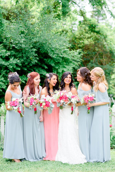
To do this, I intentionally include 2 additional folders in each gallery: the Highlights folder and the Vendor BTS folder. The Highlights folder includes 30-50 of my favorite images from the entire wedding. These are the best of the best images. I do this because I want the first reaction my clients have when they open their gallery for the first time to be: WOW, I can’t believe these are our photos!
Those first few seconds after they open their client gallery set the stage for how they are going to look at the rest of the photos. The Vendor BTS folder includes 5-10 images that I’ve taken of the vendors at the wedding throughout the day. It could be the florist delivering the flowers, the baker putting the finishing touches on the cake, or the DJ getting the crowd hyped up. These are the images that will land on their social media with a tag to your profile. 😉
Pic-Time’s New Gallery Grids and How I Use Them as a Wedding Photographer
This update really makes me excited about the Highlights folder I mentioned above. For years, I would finish editing a wedding and wished I had more say in how the photos looked together inside the gallery. Well, with the new gallery grids inside of Pic-Time, now I do. Here’s a peek at what that looks like!
Step 1: Choose a grid with your photos in mind
After you’ve uploaded your photos, head over to the Design tab and open the Grid section.
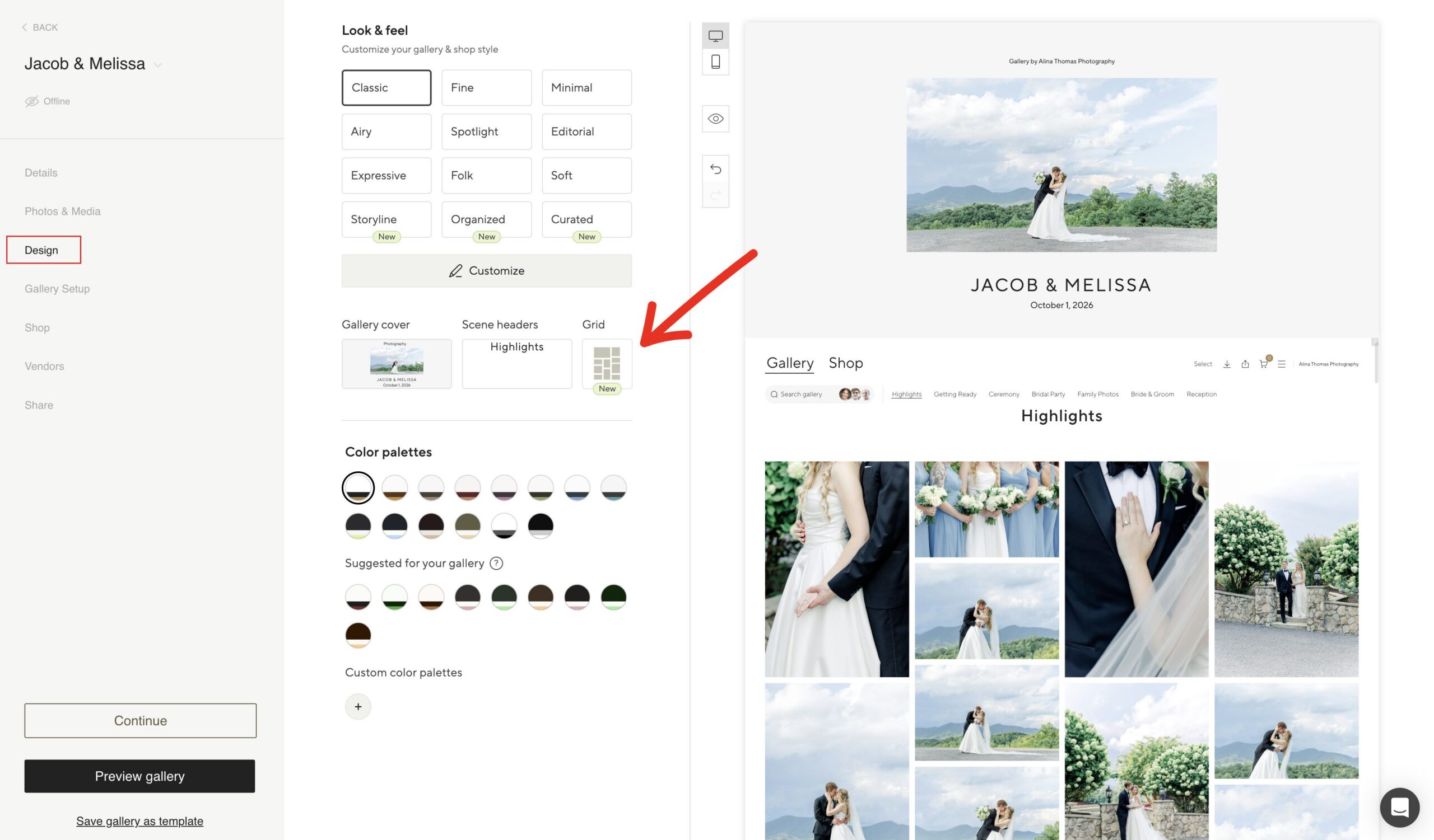
Pic-Time has seven layouts: Pic-Time, Vertical, Horizontal, Sorted, Organized, Scattered and Editorial.
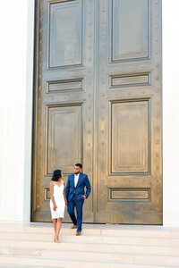
The first thing I like to do after I upload the photos to the client gallery is to try a few different layouts. I look at how the couple’s portraits sit beside the detail photos and candid shots. Does my eye know where to go? Does the page feel crowded?
The grid I use the most is the Pic-Time grid.
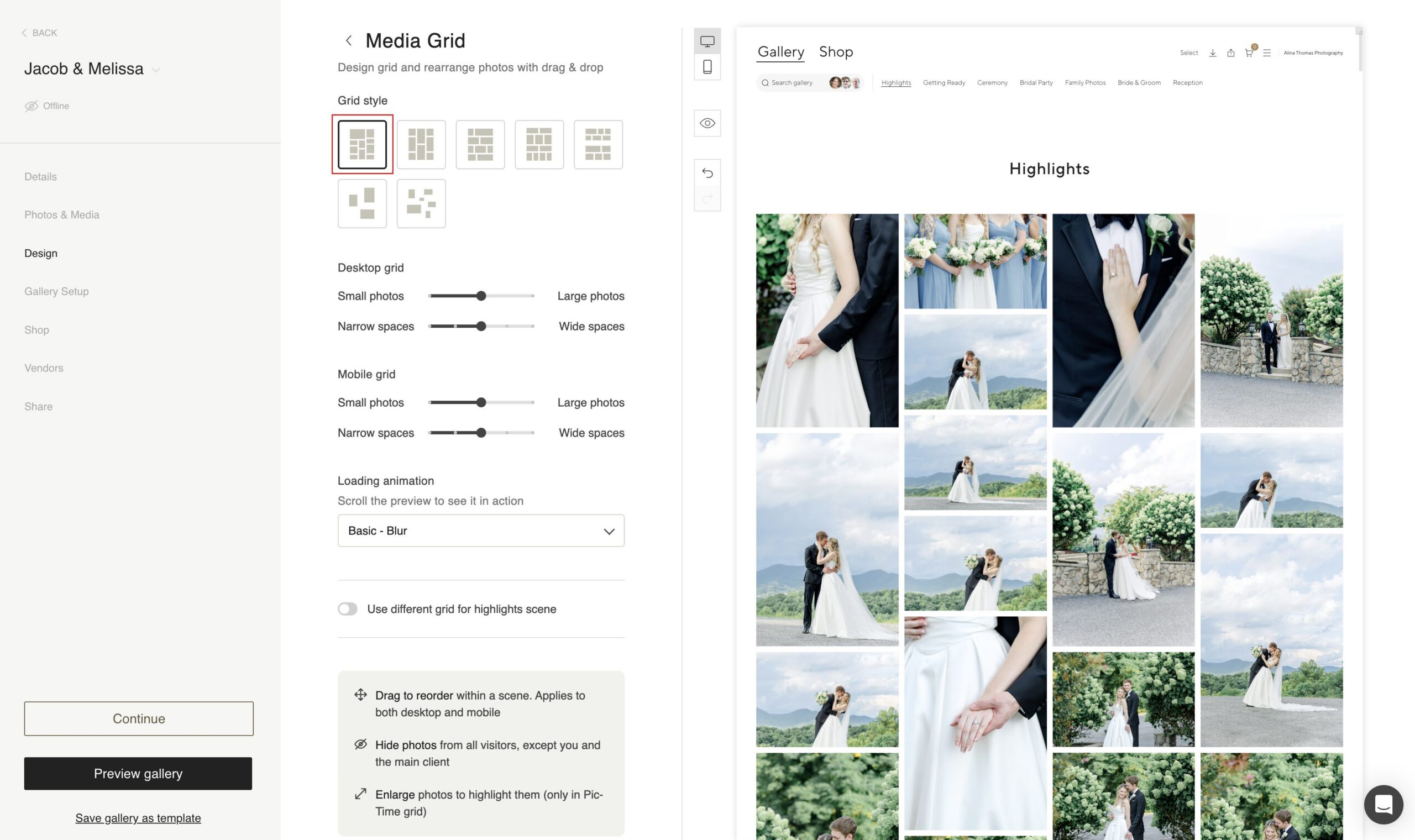
The Organized grid is a close second.
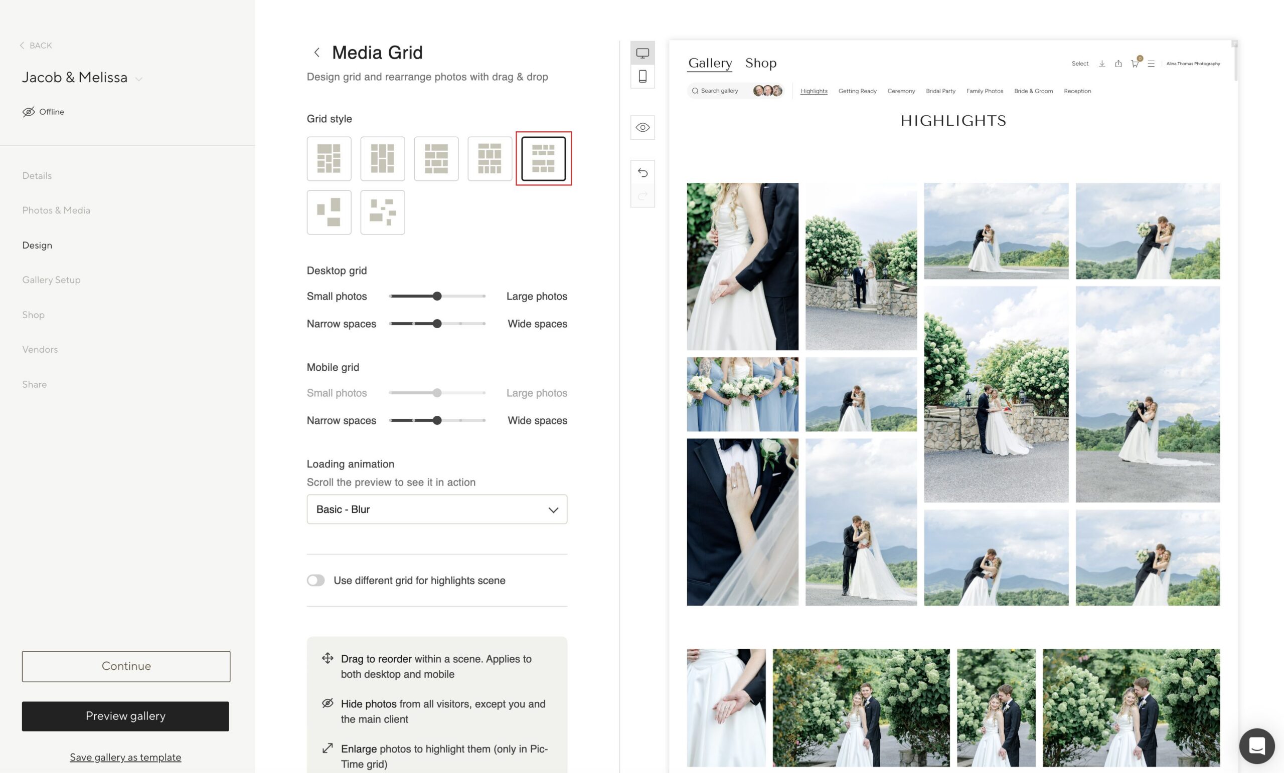
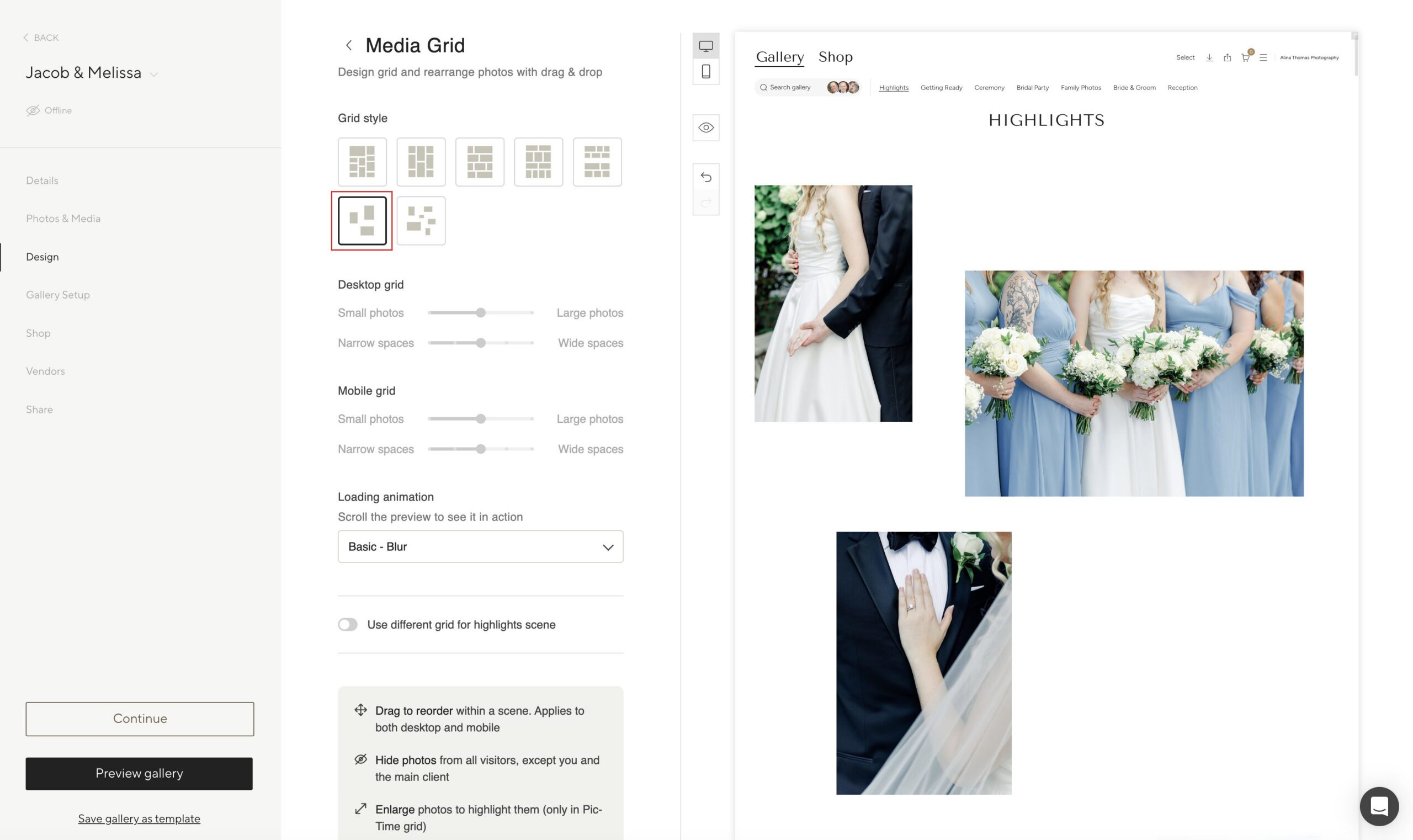
But I also love the look of the Scattered grid as it gives my images some room to breathe. Having choices makes it easier to find a presentation that works WITH the photos in your gallery.
Step 2: Adjust the size, spacing, and order
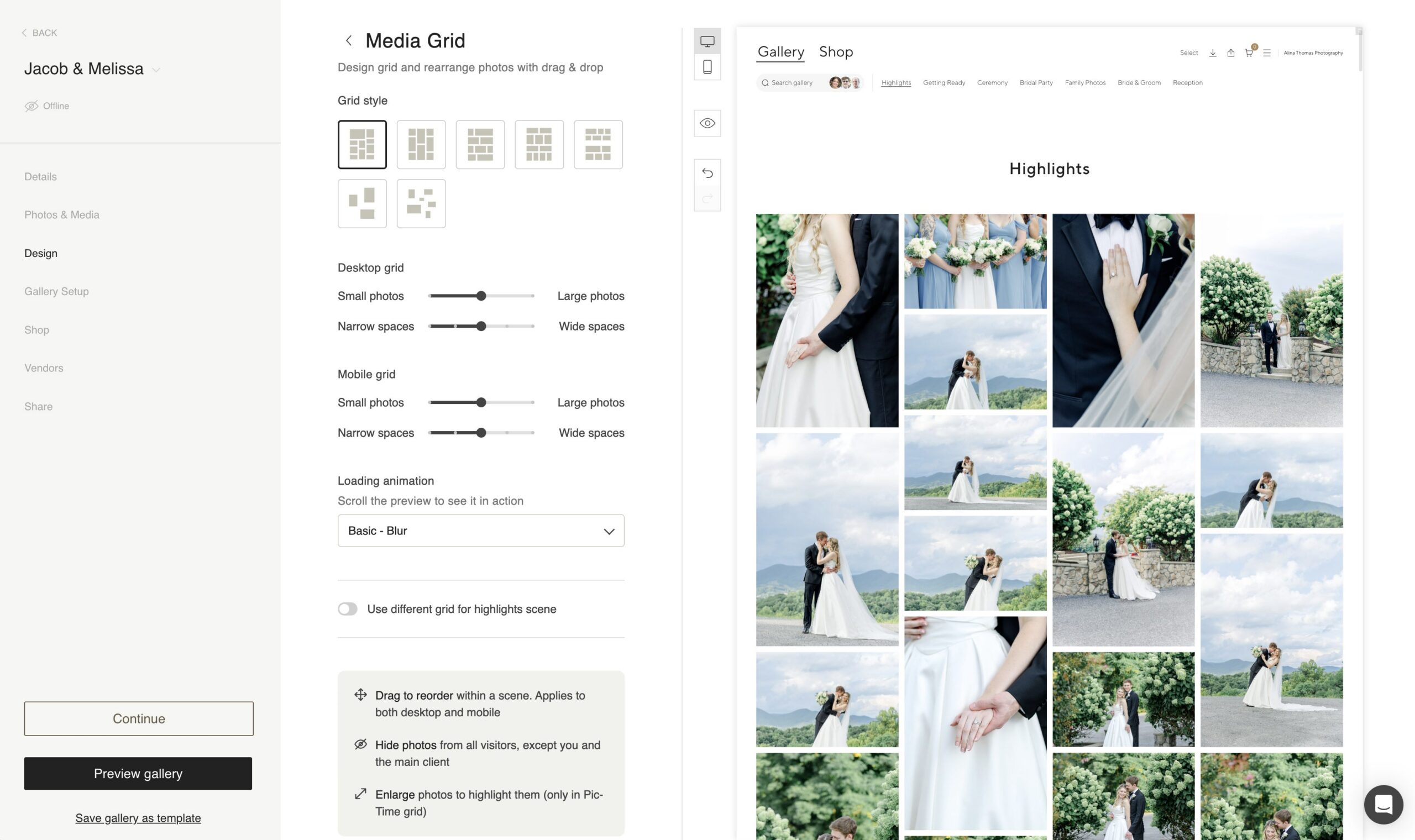
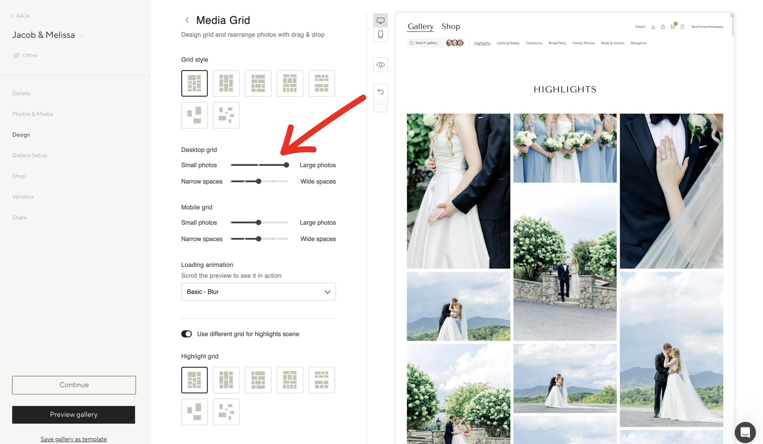
Once you choose a grid, you can adjust the image size and spacing, drag photos to reorder them, and hide images while viewing the gallery preview. With the Pic-Time grid, you can also enlarge selected photos. This is where a client gallery starts to feel more personal!
This is what the Pic-Time grid looks like without making any changes.
Here’s what the gallery looks like after I adjust the size the images are displayed.
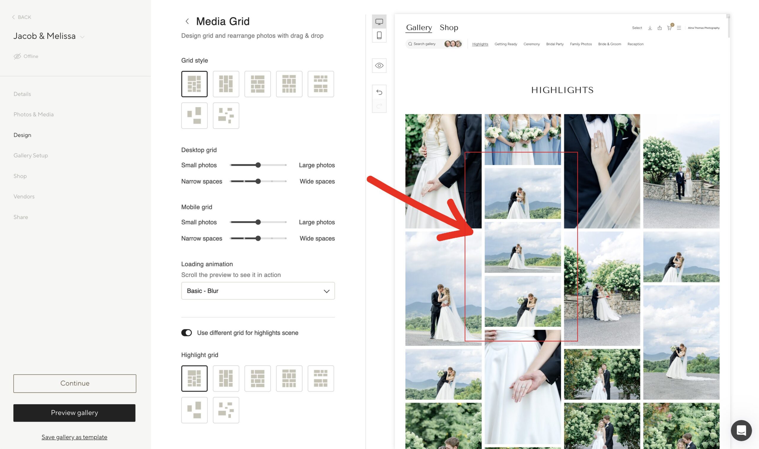
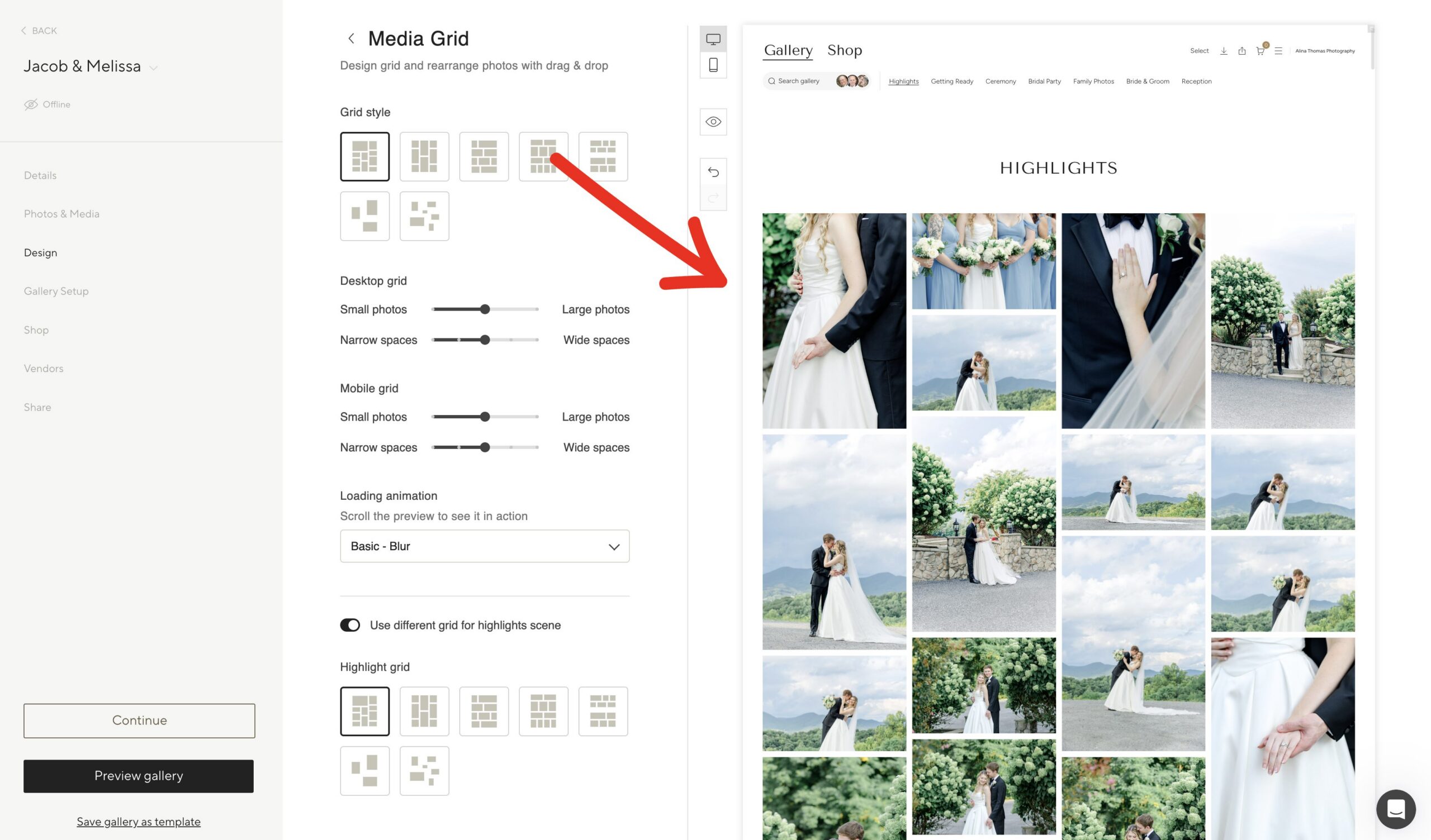
Also, as I looked through the gallery, I noticed the 3 horizontal images displayed one under the other. With Pic-Time, I can drag and drop the images until I’m happy with how my gallery looks.
This is much better.
Step 3: Create a thoughtful introduction with Highlights
On Professional and Advanced plans, you can choose a separate grid for the Highlights scene. I use this section to introduce the wedding with a smaller collection of favorites before my couples explore everything. That might include a beautiful getting ready moment, their first kiss, a few portraits or detail shots. A different layout here could help those photos stand out. I’d preview it with the full gallery to make sure the two presentations still feel connected.

Step 4: Review the gallery on mobile
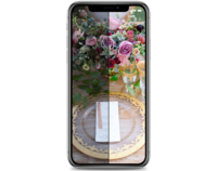
Pic-Time lets you adjust the mobile image size and spacing separately from desktop. Before delivering a wedding, I’d check both. Are the faces easy to see? Do the detail photos feel too small? Is there enough space between images? An online gallery for photographers needs to look good on the screen your clients actually use. Taking a few minutes to review the phone layout is a simple way to improve the client experience.
Here’s what the Sorted grid looks like.
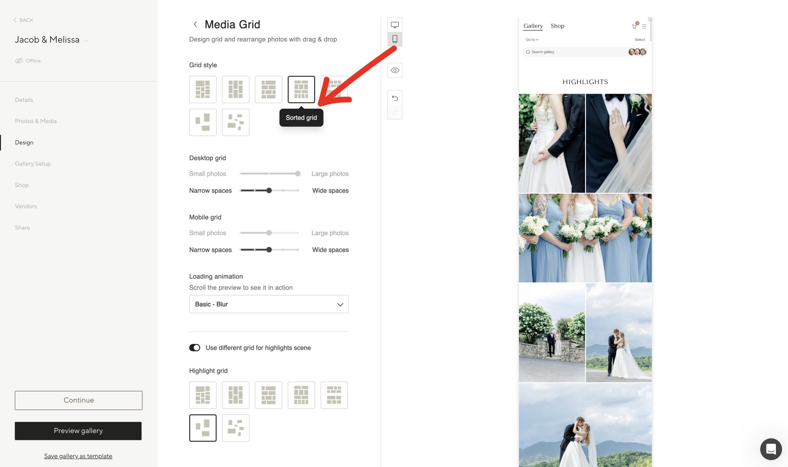
And here’s what the Editorial grid looks like. Before sending the gallery to your clients, make sure to review both the desktop and the mobile versions.
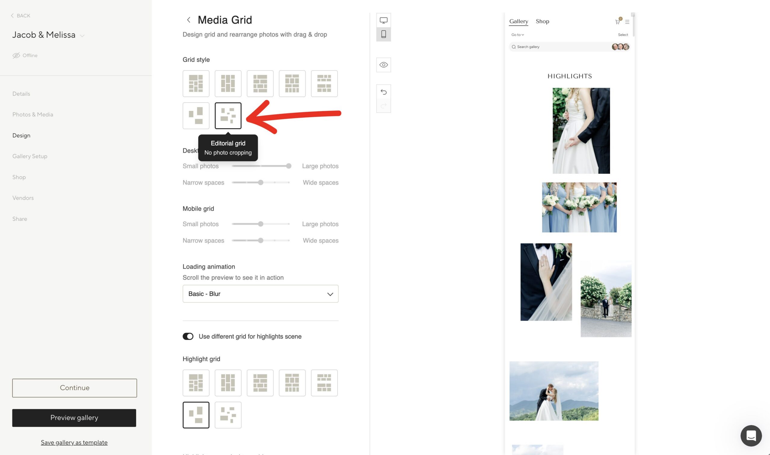
Step 5: Make the gallery feel like your brand
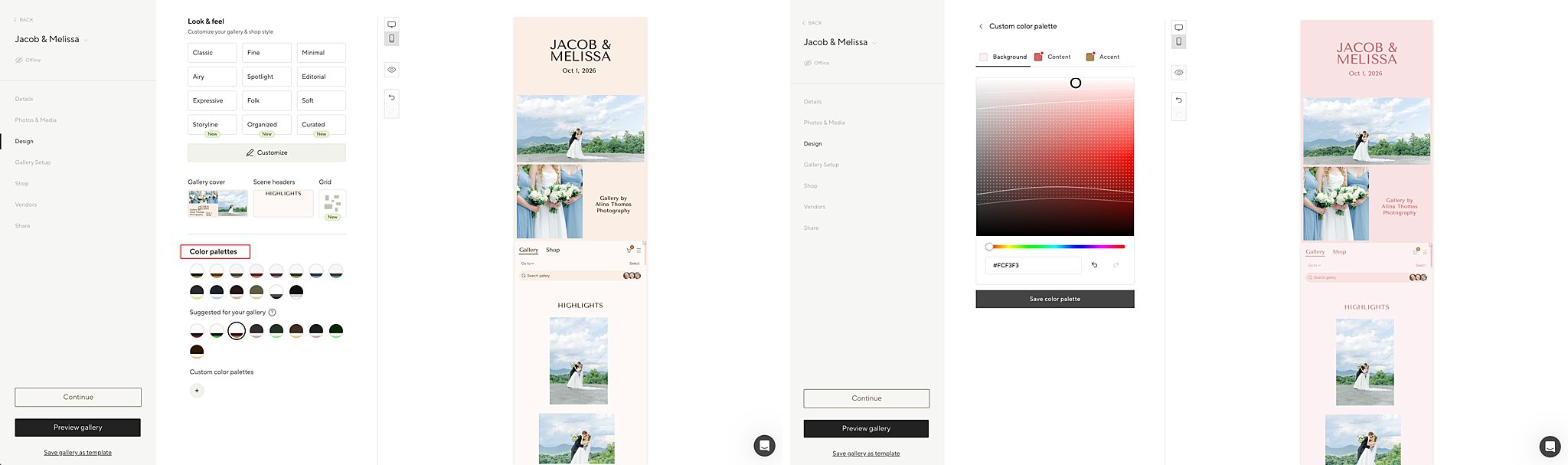
If you’ve wondered how to brand your client gallery, start with the colors and fonts you already use on your website. In addition to the grids, Pic-Time also supports uploading custom fonts and colors. This is so the gallery feels like an extension of your website.

Pic-Time also give you color pallets to choose from, but you also have full range to customize your gallery.
If you’re looking for a new client gallery for photographers, these are the kinds of details I’d compare. How much freedom do you have to arrange your images? Can you adjust the mobile presentation? Does the finished gallery feel like an extension of your brand?
For me, these small changes make the gallery delivery feel more thoughtful and intentional. I’ve already put so much care into taking and editing the photos, and now I can give that same attention to how they look together in the gallery.
If you’re using Pic-Time, try these options within your next gallery. If you’ve never used Pic-Time before, click here to get 30 days of Pic-Time for FREE. (No credit card required when using this link!)
For a more in-depth Pic-Time review, click here. 👈
What is your favorite client gallery for photographers? Let me know in the comments below.